

- Nonprofit • Community Outreach
- WordPress
- Conversion-focused CTAs
The Wanda Jo Foundation Website — Case Study
A mission-first nonprofit website designed to build trust quickly, explain programs clearly, and guide visitors toward high-intent actions like Donate, Monthly Giving, and Volunteer.

Overview>>
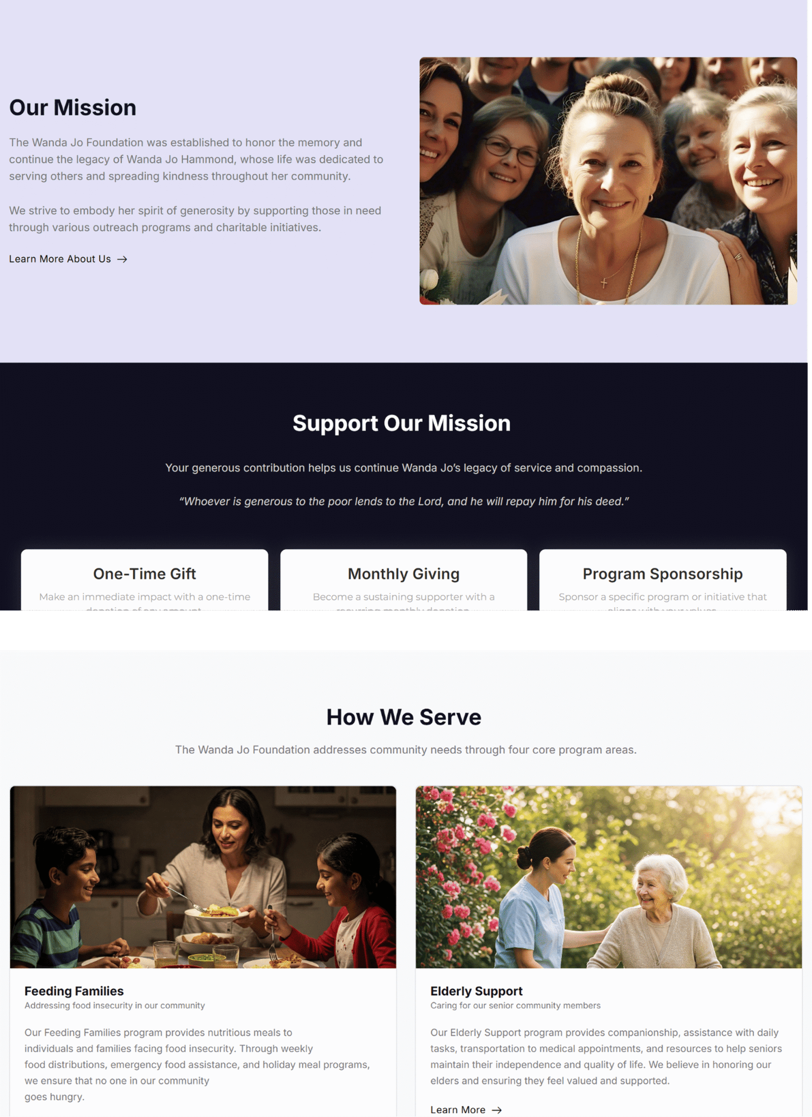
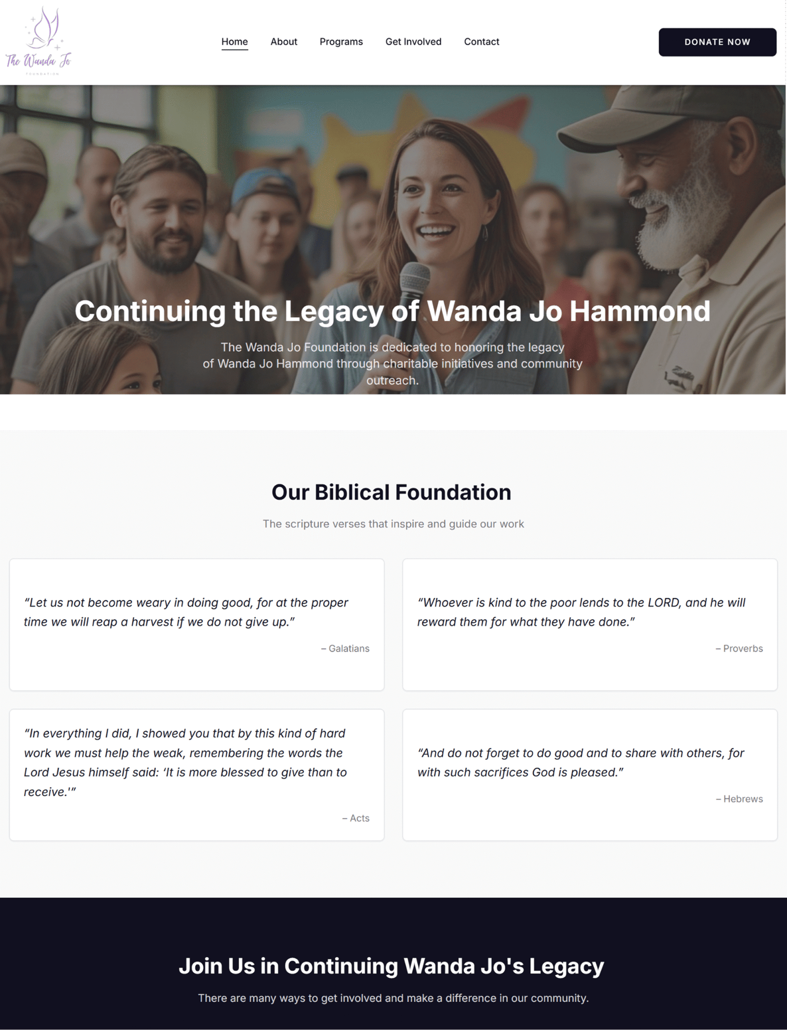
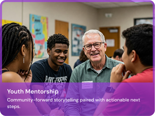
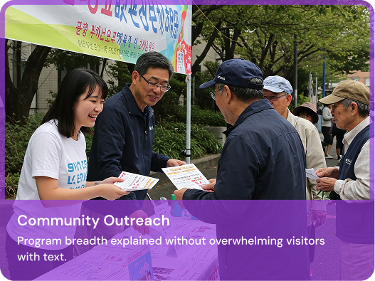
The Wanda Jo Foundation is dedicated to honoring the legacy of Wanda Jo Hammond through charitable initiatives and community outreach. The website communicates the mission, clarifies core values, and showcases program areas such as Feeding Families, Elderly Support, Youth Mentorship, and Community Outreach.
Objectives
- Make the mission instantly clear within the first screen.
- Present programs in scannable cards with “Learn more” paths.
- Increase action: donations, monthly giving, sponsorships, and volunteering.
- Build trust using impact stats + success stories + clear contact details.
Audience
- Donors looking for credibility + impact.
- Volunteers who need clear next steps.
- Community members exploring program help.
- Partners/sponsors seeking alignment and transparency.
At a Glance >>
- Navigation: Simple 5-item menu + Donate.
- Trust blocks: Values, testimonials, impact metrics.
- Conversion paths: Donate → Monthly → Sponsorships; Get Involved → Form.
- Content style: Human story + program proof.
Deliverables >>
- UI/UX + Information architecture
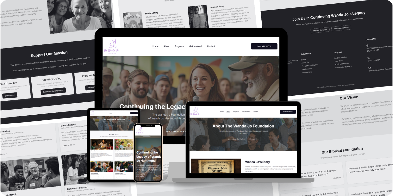
- Responsive WordPress build
- SEO-ready content structure
- CTA + form optimization
Client overview >>
A turnkey partner for foreign companies expanding to Mexico
MexInc Consultants positions itself as a specialized partner for foreign businesses expanding operations to Mexico—helping with planning, entity setup, and operational execution through an online-first process.
- Service-heavy navigation (multiple categories + sub-services) needed clarity.
- Buyers require high trust before sharing documents or booking a legal consult.
- Users want certainty: steps, timelines, and what happens next.

Challenges >>
- Nonprofits must establish trust fast—before asking for money.
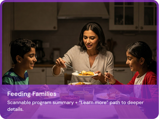
- Programs often get buried in long copy; visitors need scannable summaries.
- Multiple CTAs (Donate, Monthly, Sponsorship, Volunteer) can compete for attention.
- Content must remain editable for the foundation team without breaking layout.

Our Approach >>
- Mission-first hero: one sentence + two high-intent buttons.
- Bento trust layout: values → programs → proof → next step.
- Program cards: each program gets a clear “what it is” summary.
- Proof blocks: impact numbers + testimonials + success stories.
- Frictionless actions: Donate + Volunteer flow always one click away.

Information Architecture >>
A clean structure that maps visitor intent to a single next step:
Home → Programs → Success Stories
Designed for first-time visitors who need clarity + trust before taking action.
Donate / Monthly Giving / Volunteer
High-intent actions are prominent across key pages to reduce drop-off.

Key Design Highlights >>
The page sections are structured to mirror how donors and volunteers make decisions: clarity → trust → proof → action.

Impact Section >>
Clear, high-contrast metrics help communicate proof-of-work instantly.
25,000+
Meals Provided
500+
Seniors Supported
200+
Youth Mentored
50+
Community Events

Storytelling >>
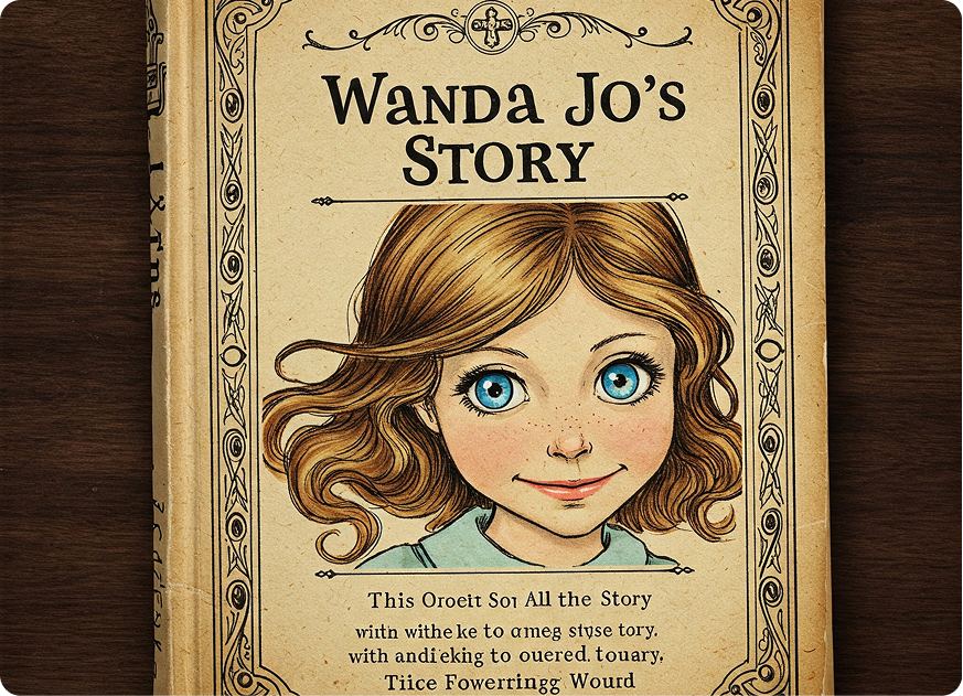
The About page anchors the mission in Wanda Jo Hammond’s legacy, making the foundation feel personal and credible. Visual storytelling supports emotional connection without sacrificing clarity.
Conversion CTAs >>
We placed “Donate” and “Get Involved” CTAs where users naturally decide—after programs, impact, and testimonials. Donation options are segmented (one-time, monthly, sponsorship) to match intent.
- Primary: Donate Now
- Secondary: Become a Monthly Donor
- Community: Volunteer Today
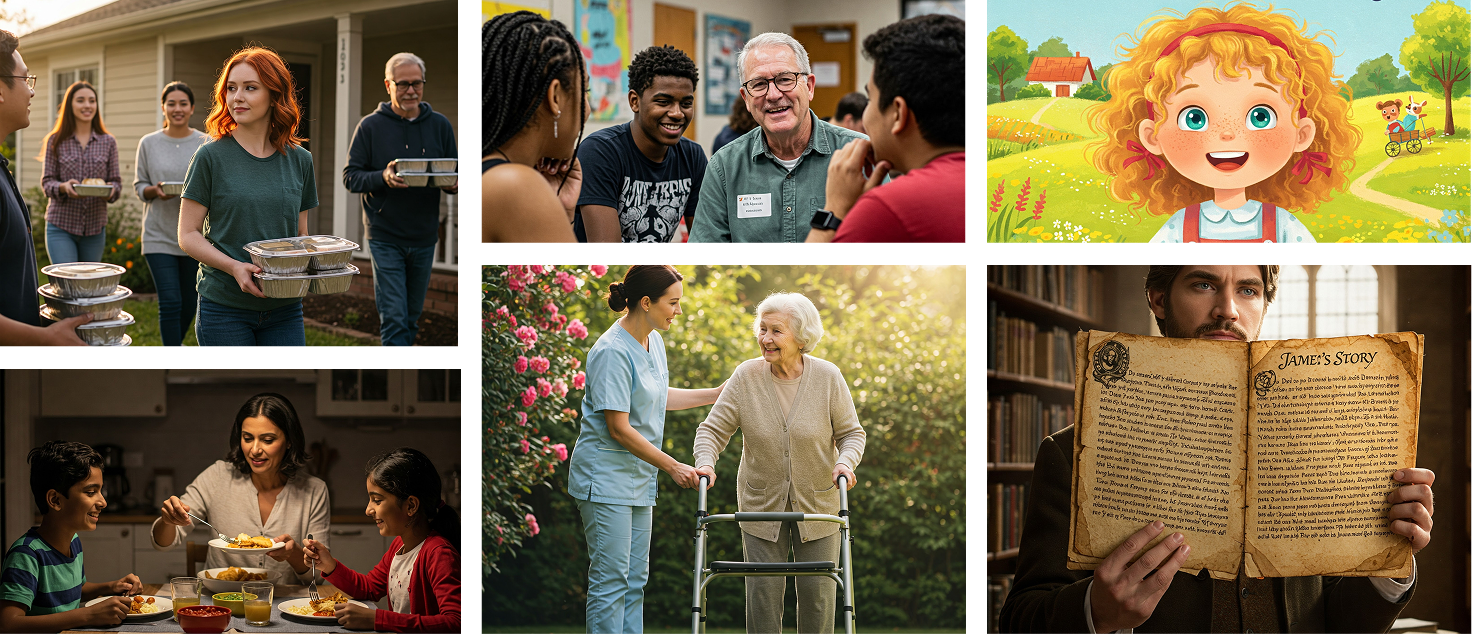
Visual Gallery >>
A clean structure that maps visitor intent to a single next step:
Frequently asked questions>>
Built to match real buyer objections and improve search visibility.
What makes a nonprofit website convert better?
Clarity + trust. Lead with mission, show proof (impact stats, stories), then present one clear next step (donate/volunteer) without clutter.
How do we keep content easy to update?
Reusable sections (program cards, impact stats, testimonials) with consistent typography/spacing so edits don’t break layout.
Can we add recurring donations?
Yes—most nonprofits use donation plugins or embedded payment flows. Segmenting one-time/monthly/sponsor improves intent match.
Can Lumestea handle maintenance?
Yes—security updates, backups, content changes, performance checks, and SEO improvements can be covered under a monthly plan.
SEO & Content Strategy >>
Clean heading structure + program topic clusters to support discoverability.
- community outreach foundation
- nonprofit feeding families program
- elderly support volunteer program
- youth mentorship community initiative
Audience
Meaningful conversion metrics to track post-launch:
- Donate button CTR (Home + Programs)
- Donation completion rate (one-time vs monthly)
- Volunteer form submissions
- Programs engagement (scroll depth + time)
Want a case study page like this for your next client?
We can turn any website delivery into a conversion-first, SEO-ready case study you can publish in one day—complete with visuals, copy, CTA, and schema.
See What Our Clients
Say About US
Sid did an outstanding job creating and refining the Talk About Prayer brand identity. He delivered high-quality logo designs, complete brand guides, and was always professional, responsive, and open to feedback. Communication was clear and consistent throughout the entire project. I’m really happy with the final results and would definitely work with him again in the future. Highly recommended!

Very serious and got job done in time, would recommend

Good work and worked very hard
Sidd did an outstanding job building both the public and private appointment scheduling modules for our platform. His technical expertise, clear communication, and attention to detail made the entire process smooth and efficient. He was proactive in solving challenges and delivered high-quality work on time. It was a pleasure working with him, and I’d gladly collaborate again in the future. Highly recommend!
Our first time working with Upwork and with foreigners was a pure learning experience, and the work was completed. We continue working on the project. Siddharth and his team were incredibly helpful, and we will definitely work together again.

Working with Siddharth has been a great experience. He’s highly skilled, communicative, and proactive—exactly what you want in a collaborator. He quickly understood our goals and contributed valuable input to help shape the product. I look forward to continuing our collaboration and would definitely recommend him to others.
